Why do marketing texts look like this?

Trust me, I have no shame about stealing a good idea. But by a combination of using the same tools, and wanting to follow common practice, marketing teams tend to coalesce around some "common" formats that just end up screaming "SPAM!" to customers
Here are five texts I've seen recently, all from different brands:
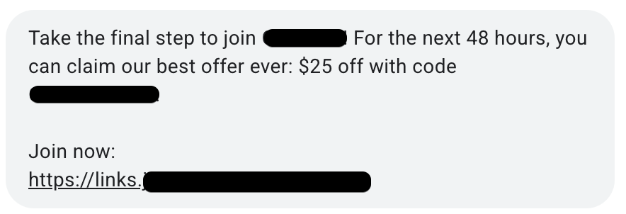
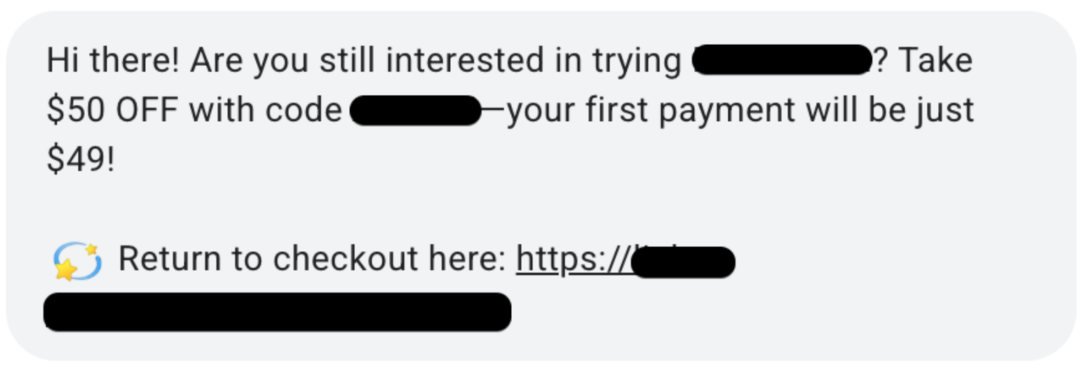
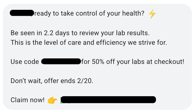
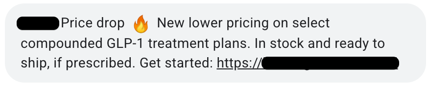
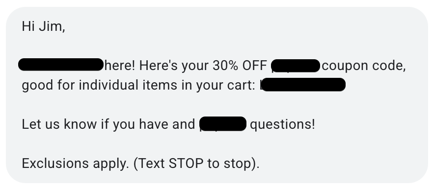
I have no doubt that most or all of these have been tested, show some lift, and even a positive ROI on their promo codes. But its like companies go out of their way to seem impersonal:
- No human uses paragraph breaks in text.
- The emojis...
- Immediate promo code conditions users to expect discounts.
- Nothing says persuasive like the 'ol "Exclusions apply. (Text STOP to stop)" sign-off.
The net effect of these signals is message blindness via pattern recognition – these texts get seen, but for most folks its just long enough to fire a few neurons that say "junk text, put down your phone".
I also know our experience at Closeable is biased – we have actual humans behind our text outreach, so we can aim for a response instead of just an immediate incentive to buy. But some of these products are $500-$1,000+ LTV's...you could make a little more effort. Lose the multi-paragraph format; use shortlinks instead of tracking parameters; one exclamation point is plenty; zero emojis would be great.